Wednesday, April 28, 2010

12 steps to the worst photograph ever - part 9 - Subject matter


Subject Matter should always be appropriate to the story being told in an image.

But again, how appropriate or inappropriate any aspects of photograph are, I don't think that is really the issue here. Because that comes down to who the intended audience was supposed to be. Nudity can never be appropriate to pious crowds, and why should it be??

I think it is extremely difficult to tell "a story" just in one picture. I think it can be done, and has been done before I am sure, but not by me. To me that is tooooo much to strive for.

Here I have an image of a tombstone of an infant, being lit up with moonlight. There is no story to tell here, but by casting the shadow of another infant on its face, it makes appear that there actually is a story to tell when there isn't. These are the kind of picture that are commonly used to make one feel stupid for "not getting it." Nobody really should "get" it because there is really nothing to tell. If you can some how convince a snob that this pic was taken by nobody other than Ansel Adams when he traveled to Japan, I am sure that there will be dumb ass critics out there who would be making wild interpretations of it.

How dumb.


Pentax K20D
DA 35 mm ltd macro
1/80 @ f/22
o ev
ISO 800
RAW

Sunday, April 25, 2010

12 steps to the worst photograph ever - part 8 - Composition



Composition is important to the design of an image, bringing all of the visual elements together in concert to express the purpose of the image. Proper composition holds the viewer in the image and prompts the viewer to look where the creator intends. Effective composition can be pleasing or disturbing, depending on the intent of the image maker.


I missed "composition" along the way somewhere. This was supposed to be number 4 or 5, or something like that. I am still amazed how in the world they the professional photographer of america (PRA) came up with this order of importance BS. I wonder if a room full of nerdy photographers who only shoot weddings sat down and yelled as loud as they could while somebody jotted down as much as possible, and the put it on the web.

I do wonder about composition. I am not sure, again, if it is all that important. It certainly can be, if what you are trying to convey requires a particular type of composition style. I purposely added style there, because they are heavily and strongly involved with each other, if either was going to meaningful in a photograph (not a sure bet each time).

Here I have a terrible picture with just as bad a composition as any. Nothing is coming together here, and they both work against each other.


Pentax K-7
D FA 100 macro WR
1/8000 @ f/3.5
-0.7 ev
ISO 800
RAW

12 steps to the worst photograph ever - part 7 - Center of Interest
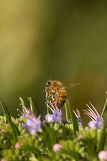


Center of Interest is the point or points on the image where the maker wants the viewer to stop as they view the image. There can be primary and secondary centers of interest. Occasionally there will be no specific center of interest, when the entire scene collectively serves as the center of interest.


I am not sure if every photograph requires a center of interest. I imagine it would be very difficult not to have a center of interest, but I think it is worth trying.

I tried, and didn't pull it off.


Pentax K-7
D FA 100mm Macro WR
1/3200 @ f/3.5
-0.7 ev
ISO 800
RAW

Friday, April 23, 2010

12 steps to the worst photograph ever - part 6 - Print presentation
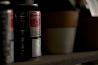


I consider printing to be the very last vital step of photography. Without a print, to me the process is not complete.

So, I do agree that print presentation is a very important aspect of photography. But that is if the audience demands that there are prints. If not, then it is a moot point. The deal is that it does depend on who the audience is. Then, it has to be that the audience, or picking certain demographic as a target audience for your photography is at least more important than the print presentation itself. PPA's site does not even mention audience. I know it is a bit too much to ask from them.

Then, predominantly, most people (or audience) will look at the pictures on their respective monitors. This is certainly an X factor. There monitors that cost less than $100, and there are ones that cost thousands. These price discrepancies are there for a reason or two; more expensive monitors project nicer images. When you submit your work for eval, not by way of sending prints instead of e-submission, then you are not only at a mercy of your critic's whims, but now you have to take into an account that the person who is looking at your photo may not have as good a set up as you do. Then he won't see what you intended. It becomes a complete waste of time.

I have a dual monitor set up. I have a cheap LG monitor for non photo application, and I also have NEC multisync P221w with a custom hood I made. Comparing between the two is really joke, but you really can not. When the same image is projected on these two different monitors, it is as if I am looking at two entirely different photos.

Good example of that is what I posted here. On my cheap monitor, it is overly bright, flares are pronounced, and there is no sense of the depth of the field that it portrays. But, things certainly change when projected on my NEC.

Printing a photo exactly as you see it on the monitor is easier said than done. It takes monitor calibration software and hardware, which I will talk about it the near future.


Pentax K-7
FA 31mm ltd
1/200 @ f/1.4
0 ev
ISO 200
RAW

Tuesday, April 20, 2010

12 steps to the worst photograph ever - part 5 - Style
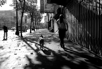


Style is defined in a number of ways as it applies to a creative image. It might be defined by a specific genre or simply be recognizable as the characteristics of how a specific artist applies light to a subject. It can impact an image in a positive manner when the subject matter and the style are appropriate for each other, or it can have a negative effect when they are at odds.


Now, stupidity is one thing, but being offensive is another.

To me this one is down right offensive. I am not sure if anybody is entitled to evaluate and criticize style. There is no measuring stick for evaluating style. Don't say, "how about originality?" That is different from style. Often these two are mixed up conveniently.

Criticizing style is like talking crap about how others raise their children.

You acknowledge it, like it or not like it, then make sure that it is entirely taken out of the evaluation process. It is irrelevant, completely.

So, if you ever get the urge to say negative things about style, you should take a deep breath, and move on to something else.


Pentax K10D
DA 21mm ltd
1/500 @ f/5.6
0 ev
ISO 100
RAW

Sunday, April 18, 2010

12 steps to the worst photograph ever - part 4 - Lighting
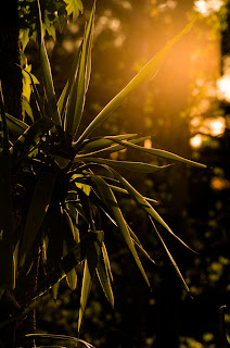

Lighting—the use and control of light—refers to how dimension, shape and roundness are defined in an image. Whether the light applied to an image is manmade or natural, proper use of it should enhance an image.


What gets me is that these guys just describe what they think each of the 12 stupid things they chose to talk about. Not only that they sound stupid to begin with, they don't tell you why it is important in what way, and why it is more important than the one that is following it.

Gee.

Lighting is very important in photography. No question about it. In fact, there are no photons, no photography as we speak. There would also be no love at first sight either. No irrational decision making. Oops. I am digressing.

I am sure that there are rules and theories about lighting. I am not sure what is commonly thought of as good use of lighting, or the other way around for that matter.

For lighting to be number four on the list is pretty lame. For me, it may well be number two or three, although not the very first, and that goes without saying.

If you would like to take good pictures(unlike me), then in order to get better with it, one needs to first be aware of where the lighting source is coming from. Direction is the key. Once you deal with enough times, then I think it becomes second nature. You can then concentrate on other aspect of lighting, such as intensity and colors and so on.

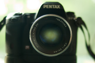
Here the main subject of this picture is "light." It has nothing to do with lighting . . . .


Pentax K-7
Zeiss planar T* 50 mm ZK
1/640 @ f/7.1
-1.3 ev
ISO 800
RAW


Saturday, April 17, 2010

NEW LENS ALERT !!
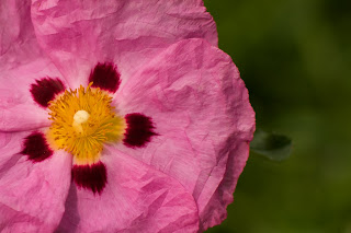


I am getting very irritated with this 12 step business. So I figure I would take a break by introducing a new addition to my ever growing lens family.

This is not a good news for me. This lens is too good. In fact, it is unreal. Very tough to take a bad photograph with this lens.


And this is not a macro lens...


12 steps to the worst photograph ever - part 3 - Technical excellence
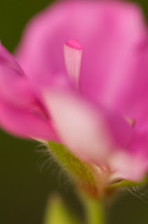


Technical excellence is the print quality of the image itself as it is presented for viewing. Retouching, manipulation, sharpness, exposure, printing, mounting, and correct color are some items that speak to the qualities of the physical print.


So, the third on their list is "technical excellence." Yes, it sounds particularly important, but I am not sure how this came in third before lighting and composition, which sound pretty important themselves.

Not only for this particular description, but ever since from the top of the list, the quality of writing is just horrid. "Technical excellence is the print quality of the image itself as it is presented for viewing. WTF??? Are any print ever not presented for viewing?

The rest of the paragraph stinks volume how clueless they really are. It is interesting that if you read down the list to number 11, it is called "technique." Reading that paragraph, I cannot tell the difference between technical excellence and technique. Here it is. You decide.

Technique is the approach used to create the image. Printing, lighting, posing, capture, presentation media, and more are part of the technique applied to an image.

Please.

You can have zero technical excellence and still be very very convincing. Have you ever seen photographers taken by children?? They are very penetrating.

Here, I have a photo with all the proper technique and presentation and all that, and it still sucks pretty bad. Dime a dozen. Photos like these are everywhere.


Pentax K-7
D FA 100 mm macro WR
1/250 @ f/8
0 ev
ISO 800
RAW

Wednesday, April 14, 2010

12 steps to the worst photograph ever - part 2 - Creativity


Creativity is the original, fresh, and external expression of the imagination of the maker by using the medium to convey an idea, message or thought.


This one is really dumb. It is simply embarrassing to even be reading it. It makes me want to dig a hole and hide it and put dirt over it.


I am not sure what creativity is. I am not sure if anybody really know. I have tried to look it up before a plenty of times. With the invention of internet and so on, finding something so simple and basic as that ought to be very simple. But no, it has not been that simple. I have not had one satisfactory explanation or description or definition of creativity.

The weird thing about creativity is that no matter what it is, its effectiveness of it in photography is limited by the degree of creativity a beholder happen to possess. It doesn't matter even if the photographer had more creativity than potatoes in Ireland, so as long as all of those potatoes cannot be entirely consumed. The work can never live up to its true quality.

When someone says, "wow, that is so creative," I am not so sure what the hell they mean by that. Does that mean that they are admitting to their own failure in that they would never have thought of taking picture like that. So, does that mean that if you took a picture of something in a way that nobody have seen before, then is that creativity?

A very attempt to evaluate or grade creativity exposes one's own stupidity. You have got to be kidding me!! There is a very good chance that there is no such a thing in this very world as "creativity." This may have been a mere concept that was pulled out of an ass by a very wordy, ineffective thinker with way too much free time in his or her hands. As you can see by the example set by religions, people often buy into a concept such as this because someone once sounded very convincing.

Here I have a picture with zero creativity. I had no message to convey. I just took it. I am certain that there will be many people who would love this picture, especially her grandparents who live across the street. To them at least the photo works because she is so beautiful. No creativity needed whatsoever.


Pentax K-7
D FA 100 mm Macro WR
1/800 @ f/8
0 ev
ISO 200
RAW

12 steps to the worst photograph ever - part 1 - IMPACT


So, this is the part 1 of how to make your photograph worse than it was. Again, this discussions will be based on this completely non-sense 12 elements of artistic photography proposed by Professional photographers of America (PPA).

Again, I find it eternally stupid. No wonder we the American do not produce important photographers. We are very good at producing philandering athletes and admiring them, but that is another story.

Please keep in mind that they say they listed all 12 points in the order of importance. I am also floored about that. I am simply amazed that they think that there is such a thing as the order of importance. My God.


So this is what they have to say about the most important aspect of photography - impact.


Impact is the sense one gets upon viewing an image for the first time. Compelling images evoke laughter, sadness, anger, pride, wonder or another intense emotion. There can be impact in any of these twelve elements.


First and foremost, I am very very weary of first impressions. I know I am not the only one who will admit to it, but there have been many girls where the first impressions did not foreshadow what lied underneath (not physically of course). I am more interested in lasting impressions. To me, first impression is nothing more than unrefined thoughtless evaluation processes of your own emotion, not the work itself. You can say that it is very debatable whose emotion is more important between the author and the viewer. I tend to think that what the viewers feel upon looking at the image is very much secondary. More important to me is the intent of a photographer, and to what extent that intent was conveyed to the the beholders. How the viewers feel to me is so random, uncontrolled that it goes straight against the whole notion of why art form bothers to exist in the first place.

This is a picture of the federal building in SF. Because of its uniqueness of the design, it provokes a lot of emotions amongst people who live in SF. The oddity of the architecture provides more or less an impact, but that is about it. It offers nothing more. To me, aesthetics runs much deeper.


Tuesday, April 13, 2010

A VERY BIG PILE OF CRAP

I am quoting from this website ran by PPA (Professional Photographers of America). In fact it is so stupid that I decided to copy the whole page and paste it here. It is probably illegal, so if it is somebody tell me so that I will take it down or alter it or something like that.

Once again, this was not written by me (thank God!).

Here it is:

The Photographic Exhibitions Committee (PEC) of PPA uses the 12 elements below as the “gold standard” to define a merit image. PEC trains judges to be mindful of these elements when judging images to the PPA merit level and to be placed in the International Print Exhibit at Imaging USA, the annual convention. The use of these 12 elements connects the modern practice of photography and its photographers to the historical practice of photography begun nearly two centuries ago.

Gold standard, my ass. I don't think they should speak on behalf of photographers from 200 years ago. I think they will be pissed.


Twelve elements have been defined as necessary for the success of an art piece or image. Any image, art piece, or photograph will reveal some measure of all twelve elements, while a visually superior example will reveal obvious consideration of each one

Hard to believe that there are exactly twelve, not eleven, not even thirteen. This is very similar to AA's 12 step program. Very scary in my opinion.


The Twelve elements listed below are in accordance to their importance.

Are you sure about that??? This sounds even more stupid than I typically do.


Impact is the sense one gets upon viewing an image for the first time. Compelling images evoke laughter, sadness, anger, pride, wonder or another intense emotion. There can be impact in any of these twelve elements.

Creativity is the original, fresh, and external expression of the imagination of the maker by using the medium to convey an idea, message or thought.

Technical excellence is the print quality of the image itself as it is presented for viewing. Retouching, manipulation, sharpness, exposure, printing, mounting, and correct color are some items that speak to the qualities of the physical print.

Composition is important to the design of an image, bringing all of the visual elements together in concert to express the purpose of the image. Proper composition holds the viewer in the image and prompts the viewer to look where the creator intends. Effective composition can be pleasing or disturbing, depending on the intent of the image maker.

Lighting—the use and control of light—refers to how dimension, shape and roundness are defined in an image. Whether the light applied to an image is manmade or natural, proper use of it should enhance an image.

Style is defined in a number of ways as it applies to a creative image. It might be defined by a specific genre or simply be recognizable as the characteristics of how a specific artist applies light to a subject. It can impact an image in a positive manner when the subject matter and the style are appropriate for each other, or it can have a negative effect when they are at odds.

Print Presentation affects an image by giving it a finished look. The mats and borders used should support and enhance the image, not distract from it.

Center of Interest is the point or points on the image where the maker wants the viewer to stop as they view the image. There can be primary and secondary centers of interest. Occasionally there will be no specific center of interest, when the entire scene collectively serves as the center of interest.

Subject Matter should always be appropriate to the story being told in an image.

Color Balance supplies harmony to an image. An image in which the tones work together, effectively supporting the image, can enhance its emotional appeal. Color balance is not always harmonious and can be used to evoke diverse feelings for effect.

Technique is the approach used to create the image. Printing, lighting, posing, capture, presentation media, and more are part of the technique applied to an image.

Story Telling refers to the image’s ability to evoke imagination. One beautiful thing about art is that each viewer might collect his own message or read her own story in an image.


The depth of stupidity here is like no others that I have even seen. It takes a hugely brainless state of mind to come up with crap like these. The level of consistency is truly unbelievable. It is genuine crap from beginning to the end. There is definitely something to be learned from all this crap. Crap crap crap. Just crap everywhere. Oh crap.

In the following days I am going to address each of the 12 craps listed down above to demonstrate how crappy they really are. Crap.

Worst Mae Bokeh
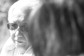


"MAE BOKEH" in Japanese loosely means "blurriness in front of the subject. Bokeh is often used behind the subject to give it a contrast between it and the background. By blurring something that is close to you than the subject itself, some claims that it can give you an unique depth perspective on 2D format, which is what photography is.


Here it was overdone on purpose, and it didn't come off appropriately. I overexposed my dad, but placed my daughter in front of him, almost overwhelming the over exposure by the sheer area of occupancy. It causes uneasiness. This is just terrible.


Pentax K-7
D FA 100mm macro WR
1/320 @ f/4.5
+ 0.3 ev
RAW


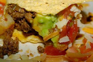
Taking product photos are very difficult. Of all things, I consider taking pictures of food the most difficult. What makes it difficult is the fact that sometimes the subject itself can have different ingredients that have textures that reflect light to a varying degree. For example, here the tomatoes and avocado appear shiny, but the cheese and tortilla do not appear that way at all.

It is also important that you take photos of the food when you are hungry, much like grocery shopping. Here, I had tacos until I was vomiting, and only then went to work. I was so nauseated by then that any angle I chose did not look appeasing.


Pnetax K10D
DA 35 mm ltd macro
1/45 @ f/8
0 ev
ISO 400
RAW

Monday, April 12, 2010

Worst at-the-park picture
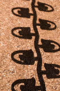


If and when you have a small child or children, one place you will get to know very well is your local park. If your kid is in luck, there may be more than just one around.

Taking a camera to the park is a double edge sword. Yes, you may be able to capture a precious moment or two, but that gets old very quickly. On top of that, your kid will not be happy with you because you are more concerned about taking pictures than having fun with your kid.

Despite all that, if you still insist that you take a camera with you, there are plenty of things stupid things that I can take a picture of and laugh about it later. This one is really really stupid.


Pentak K-7
FA 31 mm ltd
1/125 @ f/18
0 ev
ISo 400
RAW

Sunday, April 11, 2010

Politics and photography
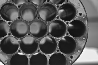


Unfortunately, photography and politics do mix. Partly because journalism would not quite be what it is today without photography. In fact, because of photography people now, compared to say 500 years ago, are interested in "things" and "people" that are not directly in front of them. Back then, things tangible were the only thing that was worth anything; now we put so much emphasis on things we cannot see. We are expected to read between the lines when reading a book. Therefore, I wonder if photography was never invented, people wouldn't be so interested in things that are happening in places so far away from where they are. Our lives would probably be more community oriented, more emphasis on small units, making things less complicated, so to speak.

Because people can now worry about what is happening thousands of miles away, they now think that they can control things that are thousands of miles away. In fact, with enough resources you can do just about anything from thousands of miles away, including dropping bombs and shooting off rocket launchers.

So, perhaps invention of photography may have caused some serious damages. Too late now though.


Pentax K10D
DA* 50-135
1/125 @ f/4.5
0 ev
ISO 100
RAW

Saturday, April 10, 2010

Macro lens as telephoto - a bad idea
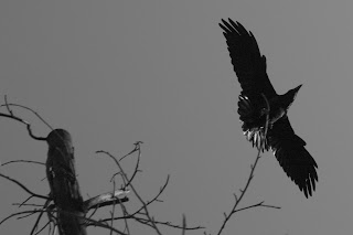


Or is it?

I am not sure. If a company markets a lens as "macro," then one would think that it is designed for things small and tiny. But then, why don't they call it "micro??"


Anyhow, I got to thinking that if I used the lens in a way that I was not supposed to, like here, then I thought that the picture would come out pretty lame. It certainly did, but not as bad as I thought. What I did was to crank up the ISO to about 800, thinking that the noise is not an issue, and also allows me to shoot with faster shutter speed.


Pentax K-7
D FA 100mm macro WR
1/1000 @ f/10
-0.7 ev
ISO 800


Thursday, April 8, 2010

Worst lighting job
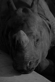


I am very much mindful of lighting. I realize that it can make or break the photo. An awesome lighting job will typically not make the ordinary picture stellar, but a lame lighting job can easily make the ordinary photographs completely putrid, as it is the case here.

Yes I am mindful of lighting, but I still don't know anything about it. I have put a lot of thought about lightings and shadows and their interplays and what benefits and consequences that can have on the photo. I think I understand the issues alright, and as a photographer, I am not sure if you need a whole lot more than that, unless you are an extraordinary fashion photographer who shoots in medium format inside the studio all day.

And, at the end of the day, I prefer natural light over flash. Yes, I have less control with the direction and intensity and other aspects of it, but that is what makes my photographs awful. As you can see here, I have zero control, which serves my purpose very well.

Wednesday, April 7, 2010

How to worsen your macro photo; lesson 1
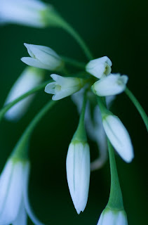

I try not to read photography instruction books. Even when I surf the blog, I try to avoid the area where things get technical and skew towards fundamentals. I am trying to make sure that my pictures I take today will not at least be no better than what I took yesterday.

Here I try semi macro photography with higher ISO. At 800 I thought I would see more noise, but not the case here. Also, I could get away with higher shutter speed, making the picture sharper, and this was without a tripod. So, there I found yesterday that higher ISO does not make the picture necessarily worse.

This picture again is not the worst, but no better than how bad I have been shooting lately.

Worst travel photography


I am not sure what travel photography is. It sounds like a scam. Isn't this just plain "snap" photography? Not that anything is wrong with it, but some people don't like snap photography. This one dude at Pentax forum left a comment saying that he would never ever vote "yes" at PPG if the photo was a snap shot. What the hell is wrong with a snap shot? Sure, less planning is put into it. Sure, it is more an accident than a well executed piece of art. But who cares? If a photo "works," then it does not matter what kind of a photograph it really is. It can be the worst photo in the world and still "works."

Here is an example of the worst kind of travel photography. One can take a picture like this from the balcony of his or her hotel room, without going anywhere. Just lazy.


Pentax K-7
DA * 55 mm f/1.4
1/250 @ f/5
0 ev
ISO 200
JPEG

Tuesday, April 6, 2010

Worst botanical photography
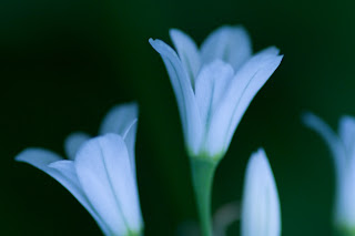


It is very difficult to do a bad job with flowers. One way to do is to look for ugly flowers, but that is like looking for ugly models in Victoria's secret catalogues. No matter how you take them, someone will say, "oh, that is pretty!"

I happen to think that words like "pretty" and "cool" are the worst kind of wording to describe a photograph. First of all, as soon as you use these word, it immediately exposes the fact that you have nothing better to say other than those two words, because either you know nothing about criticizing photography, or you have very poor vocabulary. Either way, you are exposed. Not good.

This picture is horrible as usual. It doesn't even look like a photograph. It loos like a very bad oil painting. Very shoddy.


Pentax K-7
D FA 100 mm macro WR
1/250 @ f/3.2
-0.7 ev
ISO 800
RAW

Sunday, April 4, 2010

Pentax Forum


This dude Adam runs this huge and enthusiastic forum. By and large it is a very nice site, very very stimulating and most-of-the time friendly debates about countless topic that requires fancy search techniques because the data base is becoming rather vast. I have posted about 500 comments and now apparently a "senior" member of the forum. I don't think they like me very much there because I leave smart ass comments there all the time. I will say that there are many many nice folks out there, and few of them I have gotten to know through PMs, even from far foreign countries. I hope I won't get kicked out before long.


Pentax K-7 (just kidding, unless I have two)
Pentax K10D
DA*55
1/60 @ f/5.6
0 ev
ISO 400

Thursday, April 1, 2010

Auto focusing (AF)
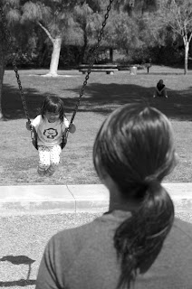
One of the biggest complaints about Pentax DSLR for the last few years amongst avid Pentax users was the not-so-fast auto focusing (is that one word??). Naturally, neighbors' lawns are always greener, and Pentaxians (not me) vehemently complained about how slow AF was compared to other brands such as Canon and Nikon.

I realize that it depends on what kind of pictures you take, but for me anyway, AF is not such a big issue. In fact, I can totally live without it. For one thing, if not so sharp pictures are thought to be lame, then I better manual focus. I don't want my pictures ever looking tack sharp there.

I also have that stupid beep that goes off when it thinks is in the right focus. I really wish there is a way to turn that off permanently.

It just seems like I am shortcutting a step or two. It is in my mind similar to zoom lenses, or multiple frames per second kind of things. It is a function of conveniences. I think it takes a lot of fun out of taking photographs.

Here, this lame picture was taken with manual focus. The main focus was obviously on my daughter, and it is not tack sharp, and I am sure that many people would criticize that point, and they are right. This picture is not very good at all. In fact, it really stinks.


Pentax K-7
DA 40 mm ltd
1/320 @ f/5.6
0 ev
ISO 100